Reliance Architecture
WHO THEY ARE
Reliance Architecture specializes in a variety of commercial architecture categories. Their roots are in educational architecture, building schools and school-related projects throughout Texas. They have since expanded their skillset and have added public and residential architecture to their repertoire making them a powerhouse architecture firm in Central Texas.
PROJECT OVERVIEW
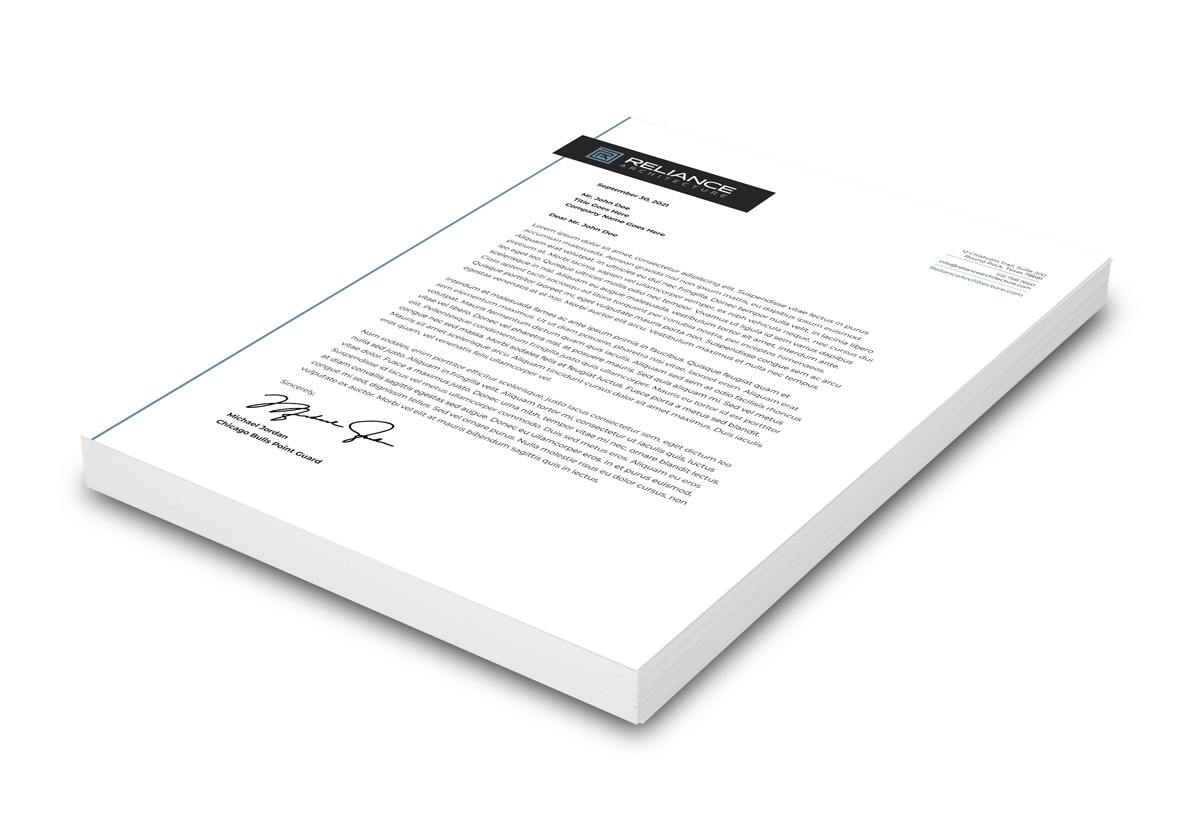
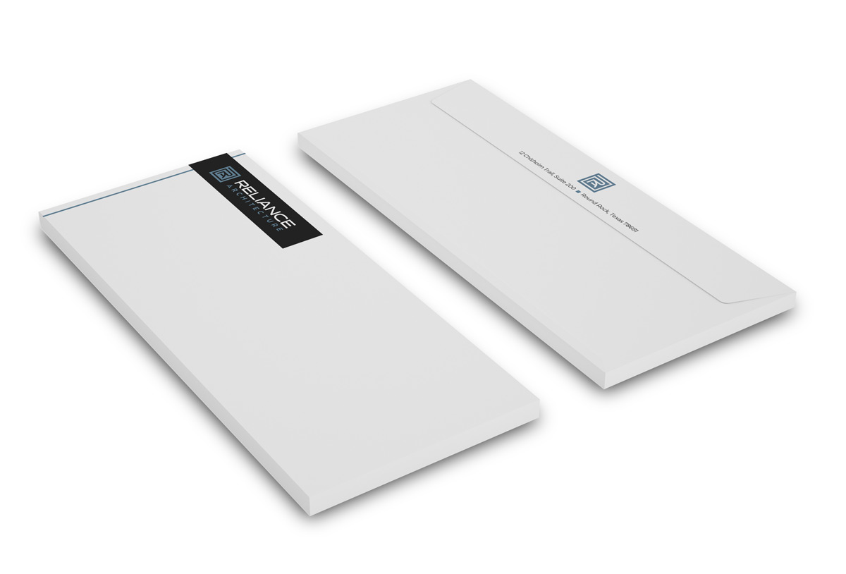
Reliance Architecture was established in 2017 by two partners with decades long experience in the architecture field. After a couple years and lots of growth they needed a rebrand that would set themselves apart and provide a solid foundation for years to come. They reached out to us in need of the full works – a logo, stationery, website, marketing materials and more to get them going in the right direction.
SERVICES
- Logo Design
- Web Design
- Brochure Design
- Event Branding
- Sign Design
- Printing Services
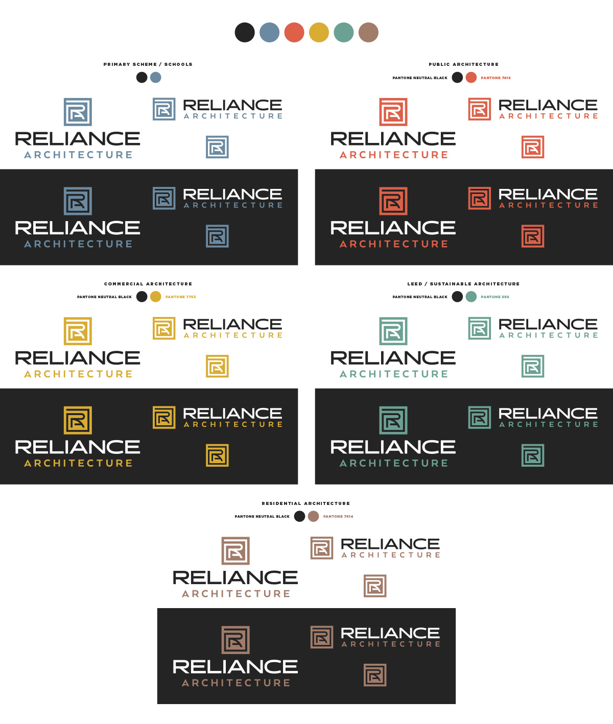
Because they plan to market to specific industries, we created color coded versions of their logo depending on the architectural category.
Sub logos can make it easy for potential clients and customers to navigate a brand that has many service offerings. In this case their primary customer market is education, and the foundation of their business, so we chose blue for that category. For example, in the future they may market to a commercial architecture outreach via web ads or mail in which they’ll use the yellow logo and branding for that industry. When a user visits their website in response to the ad they’ll follow the yellow color coded call to action on the homepage and projects to view only relevant information to their industry, in this case commercial.
WordPress websites allow for flexibility, easy of use, and great foundational SEO properties… if built right.
At Left Hand Design we develop our WordPress sites from the ground up. We don’t leverage third party templates or drag and drop WordPress builders to construct our websites. Going that route always proves to be problematic a couple years down the line, not to mention they’re easily exploitable by hackers and are commonly not supported by the original dev team after a couple years. This often leaves you with a dead site. Instead we focus on building the site as simple as possible on the backend, sticking to the original framework of WordPress. With less moving parts on the backend theres not as many things to break, and it’ll keep your site running snappy and secure with minimal maintenance.
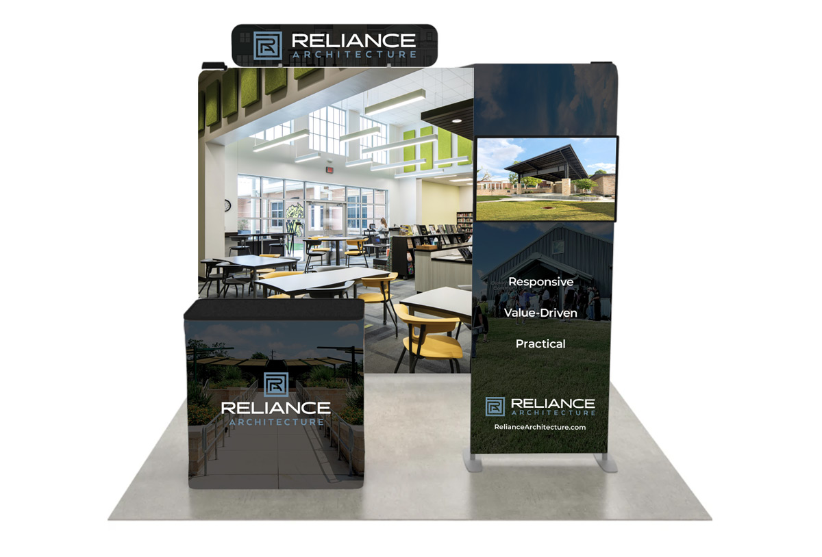
Stay tuned for more!
As we work together we’ll continue to update this page as more projects are completed.
If you’re in need of a logo design or a similar full spectrum branding package like this feel free to contact us here. We look forward to hearing about your next project!