Your logo is the face of your brand—a silent ambassador that speaks volumes before a single word is exchanged. And color? That’s its most persuasive language. The right palette can evoke trust, excitement, or sophistication, while the wrong one can send mixed signals. So, how do you pick the perfect colors for your logo? Let’s break it down.
Your Texas business deserves the best. Explore our professional logo design services in Austin, Houston, Dallas, and San Antonio.
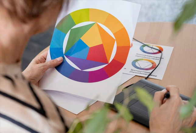
Understand Color Psychology
Colors aren’t just decorative; they’re psychological triggers. Here’s what different hues communicate:
| Color | Emotion/Association | Best For |
| Blue | Trust, professionalism | Finance, tech, healthcare |
| Red | Energy, passion | Food, entertainment, sports |
| Green | Growth, nature | Eco-friendly brands, wellness |
| Yellow | Optimism, warmth | Creative industries, retail |
| Black | Luxury, sophistication | Fashion, premium brands |
| Purple | Creativity, royalty | Beauty, artistic ventures |
For example, Starbucks uses green to emphasize sustainability, while Coca-Cola leverages red for excitement and nostalgia.
Consider Your Industry & Competition
Look at competitors’ logos—what colors dominate your niche? If you’re in finance, blues and grays are common because they convey stability. But if you want to stand out, you might introduce an unexpected accent color.
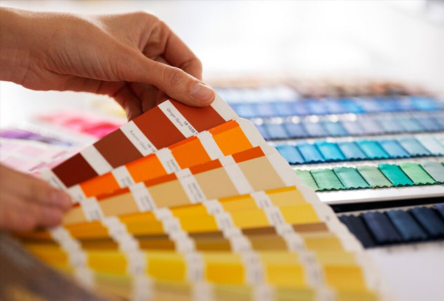
Keep It Simple (1-3 Colors Max)
![]()
Too many colors can make a logo chaotic. Brands like Nike (black and white) and Google (multi-color but balanced) prove that simplicity works.
Test for Versatility
Your logo should look great in:
- Black & white (for faxes, stamps)
- Small sizes (favicons, social media)
- Different backgrounds (light/dark modes)
Think About Cultural Associations
Colors mean different things globally. Red is lucky in China but can signify danger in the West. If your brand is international, research accordingly.
Use the Right Color Combinations
- Monochromatic: Different shades of one color (e.g., Instagram’s gradient)
- Complementary: Opposite colors (e.g., FedEx’s purple and orange)
- Analogous: Neighboring colors (e.g., Spotify’s green and teal)
Get Professional Help
Choosing colors isn’t just about preference—it’s strategy. At Left Hand Design, we specialize in crafting logos with intentional color schemes that resonate with your audience.
Ready for a Logo That Stands Out?
Get a Custom Logo Design from Left Hand Design today—where psychology meets creativity.
See our logo design work and discover how we turn ideas into unforgettable brands.
Final Thought
Your logo’s colors are the first handshake with your audience. Make it memorable.
Need expert guidance? Left Hand Design’s design team is here to help.