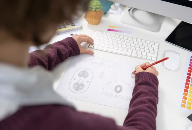
Your logo is your brand’s fingerprint—a tiny graphic that carries the weight of your story, values, and ambitions. It’s the difference between being forgettable and becoming iconic. Think of Starbucks’ siren or the golden arches of McDonald’s: these symbols don’t just identify a business—they evoke experiences. For small businesses, a logo isn’t a luxury; it’s a necessity. Here’s how to craft one that resonates, impresses, and endures.
Your Texas business deserves the best. Explore our professional logo design services in Austin, Houston, Dallas, and San Antonio.
Why Your Logo Is Your Silent Salesperson
A well-designed logo can increase brand recognition by 80%, according to a 2024 visual branding study by Nielsen. It’s the face of your business on websites, packaging, social media, and beyond. But this isn’t about slapping shapes together—it’s about creating a visual shorthand for what you stand for.
Step 1: Unearth Your Brand’s Core Identity
Before sketching a single line, define your brand’s personality. Are you bold and disruptive, like Red Bull? Warm and community-driven, like Etsy? Use tools like Milanote’s Brand Strategy Template to map your mission, audience, and unique selling points.
Pro tip: Ask customers to describe your business in three words. Their answers might surprise you—and inform your design.
Step 2: Simplicity Is the Ultimate Sophistication
The best logos are often the simplest. Amazon’s arrow-smile hints at “A to Z” offerings, while Twitter’s bird (now “X”) embodies rapid communication. Avoid clutter—if your logo needs a five-minute explanation, it’s missing the mark.
| Logo Type | Strengths | Example |
| Wordmark | Builds name recognition (e.g., Google) | Coca-Cola, FedEx |
| Symbol/Icon | Universal appeal (e.g., Apple) | Nike Swoosh, Target Bullseye |
| Combination Mark | Balances text and imagery | Burger King, Lacoste |
Step 3: Color Choices That Command Attention
Color accounts for 85% of purchasing decisions, per Pantone’s 2023 Color in Branding Report. Blue telegraphs trust (LinkedIn, PayPal), while green signals growth (Starbucks, Whole Foods). Use a tool like Coolors to experiment with palettes, but limit yourself to 2–3 hues to avoid visual chaos.
Step 4: Typography with Intent
Fonts are the voice of your logo. Slack’s custom sans-serif feels approachable yet tech-savvy, while Vogue’s bold serif screams luxury. Platforms like FontPair help you mix typefaces without clashing.
Step 5: Stress-Test Your Design
Your logo must thrive in the wild. Print it on a business card. Shrink it for a mobile screen. Does it still read clearly? If not, strip it back. A versatile logo works in monochrome, scales to any size, and looks sharp on merch—whether it’s etched on a mug or plastered on a billboard.
DIY Tools vs. Professional Polish: Which Route Wins?
Platforms like Canva and Looka offer DIY solutions for startups on a budget. But if you’re serious about standing out, partnering with experts pays off. For instance, Left Hand Design specializes in crafting custom logos that blend creativity with strategic thinking—ensuring your design isn’t just beautiful, but business-savvy.
3 Logo Pitfalls That Scream “Amateur Hour”
- Overused Symbols: Globes, swooshes, and generic icons drown your brand in sameness.
- Trend Chasing: Neon gradients and 3D effects might feel fresh today—but dated tomorrow.
- Font Overload: Using more than two typefaces muddies your message.
From Concept to Icon: Protect Your Investment
Once your logo is finalized, trademark it via the USPTO to guard against copycats. Then, deploy it consistently across every touchpoint: your website, email signatures, packaging, and social bios. Repetition builds recognition.
See our logo design work and discover how we turn ideas into unforgettable brands.
Ready to Make Your Mark?
Designing a logo is equal parts art and strategy. Start by sketching rough ideas (no degree in illustration required). Refine. Test. Repeat. But if you’re craving a logo that feels like it was pulled from the DNA of your brand, our team at Left Hand Design is here to help. We transform visions into visuals that resonate, convert, and endure.


