A great logo is more than just a pretty graphic—it’s the face of your brand, the silent ambassador that speaks volumes before a single word is read. Think of the golden arches of McDonald’s, the bitten apple of Apple, or Nike’s iconic swoosh. These logos are instantly recognizable, evoking emotion and trust in milliseconds.
But what separates a forgettable logo from a legendary one? Let’s break it down.
Your Texas business deserves the best. Explore our professional logo design services in Austin, Houston, Dallas, and San Antonio.
The 5 Pillars of an Exceptional Logo Design
1. Simplicity – Less is More
The best logos are clean, uncluttered, and easy to recognize at a glance. A simple design ensures scalability—whether it’s on a business card or a billboard, it remains sharp and legible. Consider how Adidas’ three stripes or Twitter’s bird communicate instantly without complexity.
2. Memorability – Stick in the Mind
A logo should be distinctive enough to linger in memory. Unique shapes, clever negative space (like the hidden arrow in the FedEx logo), or bold typography can make a design unforgettable.
3. Timelessness – Avoid Trends That Fade
While it’s tempting to chase design fads, a logo should endure decades. Brands like Coca-Cola and Disney have maintained their core identity for over a century with only subtle refinements.
4. Versatility – Work Across All Mediums
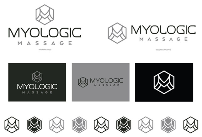
A great logo performs well in color, black-and-white, small sizes, and digital formats. Test your logo on different backgrounds, merchandise, and apps to ensure adaptability.
5. Meaning – Reflect Your Brand’s Essence
A logo should tell a story. Amazon’s smile-arrow suggests delivery from A to Z, while the WWF panda symbolizes wildlife conservation. Your logo must align with your brand’s mission and values.
The Psychology Behind Effective Logos
Colors, shapes, and fonts aren’t arbitrary—they trigger subconscious reactions:
- Colors:
- Blue (Trust, Stability) – Used by Facebook, IBM
- Red (Energy, Passion) – Netflix, Coca-Cola
- Green (Growth, Health) – Starbucks, Whole Foods
- Shapes:
- Circles (Unity, Community) – BMW, Pepsi
- Squares (Balance, Reliability) – Microsoft, National Geographic
- Triangles (Innovation, Power) – Adidas, Google Play
- Typography:
- Serif fonts (Tradition, Authority) – Times New Roman, Vogue
- Sans-serif fonts (Modern, Approachable) – Google, Airbnb
Common Logo Design Mistakes to Avoid
| Mistake | Why It Fails | Better Approach |
| Overly complex | Hard to recognize when scaled down | Simplify shapes, reduce details |
| Relying on trends | Looks outdated quickly | Focus on classic, enduring design |
| Poor font choice | Difficult to read or mismatched tone | Pick legible, brand-aligned typography |
| Weak color contrast | Blends into backgrounds | Ensure visibility in all contexts |
Ready for a Logo That Elevates Your Brand?
Your logo is the cornerstone of your brand identity—it deserves expertise, creativity, and strategic thinking. At Left Hand Design, we craft logos that aren’t just visually striking but also built to last. Whether you’re launching a startup or refreshing an established brand, our designs blend artistry with market-smart precision.
See our logo design work and discover how we turn ideas into unforgettable brands.
Final Thought
A logo isn’t just a graphic; it’s your brand’s handshake with the world. Invest in a design that’s simple, memorable, and timeless—because first impressions last forever.
Get a Logo That Stands Out—Explore Left Hand Design’s Portfolio Today


