













































Austin Dentist Logo Design for Distinctive Dental Brands

Strategic Identity Systems for Practices, Specialists & Oral-Care Companies

Build Patient Trust Before the First Appointment

logo small

Since 2004, Left Hand Design has built brand identities from our Austin studio for organizations competing in one of the country’s most design-aware markets. For dentists, the logo is the keystone: the most visible part of a larger system that must communicate clinical precision, cleanliness, trust, and a clear point of view.

Austin patients encounter your practice across search results, signage, websites, forms, appointment cards, and the office itself. We create a cohesive visual identity—not just a standalone logo—so every touchpoint feels consistent and credible. Our typical four-to-six-week process moves through discovery and local market research, concept development, two-to-three revision rounds, and final delivery of a practical asset package.

Reach out today to discuss an Austin dental brand identity built for your practice, patient mix, and long-term goals.

A Dental Branding System Built for Every Patient Touchpoint

A dental identity needs to perform from the first search to the final appointment. These services keep every patient touchpoint clear, consistent, and recognizably yours.

icon logo

Practice Positioning & Logo System

We create primary, secondary, and mark-only logos, then define color, typography, usage, and clear-space rules in a practical brand guide your team and vendors can use.

icon web

Patient-Focused Website Design

We apply the identity to WordPress or Squarespace websites with clear UX, accessible content, and conversion paths designed around new-patient inquiries.

icon package

Packaging, Signage & Practice Applications

For dental startups and oral-care products, we extend the identity to packaging that feels credible in both retail and clinical settings.

Click Lefty to see more services!

left hand design austin tx banner beau morrow

Selected Identity Work from Our Austin Studio

How Austin Dental Brands Earn Recognition and Trust

Designing for Austin’s Dental Demographics

Dentist and Child Giving High Five in Office

Design for the Patients You Want to Reach

Family practices serving Circle C Ranch, Round Rock, and similar Austin-area communities need a visual language that feels welcoming without looking childish or generic. We balance warmth, clarity, and professional restraint so parents feel confident before the first visit.

Joyous dental clinic patient high-fiving pediatric dentist

Differentiate Without Dental Clichés

Patients working in North Burnet, Gateway, and Austin’s tech corridors expect polished digital experiences. A clean identity and legible logo system help your practice signal modern efficiency across search, mobile, scheduling, and office signage.

Attract the right customers with clear positioning_

Scale from Mobile Search to Office Signage

Cosmetic and specialty practices near The Domain or West Lake Hills often compete on expertise and experience. Refined typography, disciplined color, and a distinctive mark can position the practice as premium without relying on predictable dental clichés.

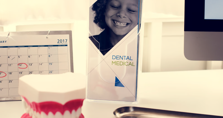
Dental Exam Room with Model Teeth and Brochure

Build a Consistent Experience Across the Practice

Austin patients meet your brand on Google, your website, forms, appointment cards, signage, social media, and the office environment. We build flexible logo lockups and clear standards so every interaction reinforces the same level of care.

Austin Dentist Logo Design FAQs

Trust is built through disciplined details. We use balanced layouts, highly legible typography, and color palettes chosen to communicate calm, cleanliness, and professionalism. We avoid default dental clichés unless they can be transformed into a distinctive, ownable idea.

It can. A practice in Hyde Park or Clarksville may benefit from subtle heritage cues in typography, illustration, or proportion. The goal is not nostalgia for its own sake; it is a sense of place and permanence that still works across contemporary patient touchpoints.

Most dental identity projects take four to six weeks. That schedule usually includes discovery and market research, initial concept presentation, two to three rounds of focused revisions, and delivery of the final logo suite and brand guidelines.

Absolutely. Simplicity often improves recognition and makes a logo easier to use on websites, signage, uniforms, and small digital icons. The distinction comes from proportion, typography, spacing, and a concept specific to the practice—not from adding more elements.

Yes. The logo should work with the clinic’s colors, typography, interior style, website, forms, signage, and marketing materials. We design flexible lockups and practical guidelines so the entire patient experience feels cohesive and professional.