Electrical Logo Design for Contractors & Service Brands

Strategic Identity Systems for Electricians, Contractors & Power-Service Companies

A Brand Built to Work as Hard as Your Crew

logo small

Since 2004, Left Hand Design has created distinctive visual identities from our Austin studio for businesses that need to be recognized quickly and remembered clearly. For electricians and electrical contractors, the logo is the most visible piece of a larger system—one that should feel capable, organized, and appropriate to the work without relying on a generic bolt, plug, or lightbulb.

Customers may first encounter the company on a service truck, uniform, yard sign, estimate, invoice, website, map listing, or referral. We coordinate the logo, typography, color, and practical applications so those touchpoints feel connected from the first search through the completed job.

Our typical four-to-six-week identity process includes discovery, category and competitor research, original concept development, two to three revision rounds, and organized production files. The direction is shaped around your services, customers, service area, crew, fleet, and growth plans—not a one-size-fits-all contractor template.


Electrical Branding Built for Every Customer Touchpoint

A useful electrical identity must remain clear at road speed, at small digital sizes, and across everyday field materials. We build the system around how homeowners, facility teams, builders, and referral partners actually encounter the business.

icon logo

Positioning & Responsive Logo System

We clarify the company’s services, customers, service area, personality, and competitive position, then create primary, secondary, and mark-only logos with color, typography, clear-space, and usage guidance.

icon web

Conversion-Focused Website Design

We extend the identity to WordPress or Squarespace websites with readable service content, mobile-friendly layouts, accessible structure, and clear paths for quote or service inquiries.

icon package

Fleet, Uniform & Field Applications

We adapt the system to service vehicles, uniforms, hard hats, signage, yard signs, estimates, invoices, business cards, social graphics, and other practical contractor touchpoints.

Explore More Left Hand Design Services

left hand design austin tx banner beau morrow

Selected Identity Work from Our Austin Studio

What Clients Say About Working with Left Hand Design

What an Effective Electrical Identity Needs to Do

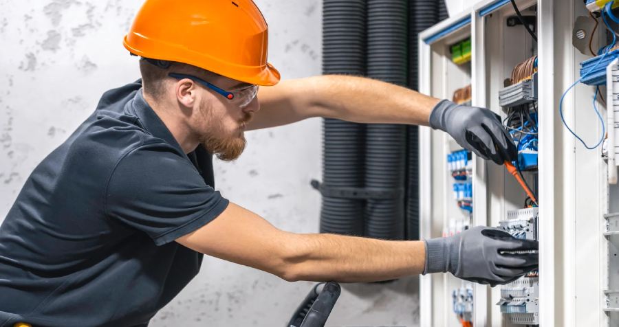
Electrician Repairing Wires Inside Electrical Box on Ladder

Stay Recognizable at Road Speed and Small Sizes

Electrical brands often appear on moving service vehicles, map listings, social avatars, uniforms, and small estimate headers. Responsive lockups and mark-only variations keep the business identifiable when detail, viewing time, and space are limited.

Create trust from the first impression

Differentiate Beyond Bolts, Plugs & Lightbulbs

Familiar electrical symbols communicate the category quickly, but they can also make contractors look interchangeable. We look for an ownable idea rooted in the company name, service mix, audience, values, or local context, then test it against relevant competitors.

Attract the right customers with clear positioning_

Support Reliability Without Unsupported Claims

Clear typography, disciplined color, and consistent applications can help a company appear organized and professional. A visual identity cannot prove licensing, safety, workmanship, or response times, so the design should support accurate communication rather than stand in for evidence.

electricians

Keep Every Crew, Vehicle & Location Consistent

A practical brand guide helps employees, vehicle-wrap vendors, sign fabricators, printers, developers, and marketing partners apply the same visual system. That consistency becomes more important as the fleet, crew, service territory, or number of locations grows.

Electrical Logo Design FAQs

It should make the company easy to recognize while supporting the qualities customers need to understand: the work offered, the service area, and the brand’s personality. Typography, color, proportion, and visual language can suggest capability and organization, but the logo should not make licensing, safety, or performance claims it cannot prove.

We begin with the company name, service mix, customers, story, and competitive context instead of starting with a category symbol. Familiar electrical imagery can still work when it is transformed into something distinctive and ownable, but we also explore typography, abstract forms, monograms, and ideas tied directly to the business.

Yes. We test the strongest direction at realistic sizes and on practical applications such as service vehicles, uniforms, hard hats, yard signs, website headers, map listings, social avatars, estimates, and invoices. Responsive lockups and mark-only versions keep the identity clear across those surfaces.

Final delivery typically includes primary, secondary, and mark-only logo variations; color specifications; typography recommendations; clear-space and minimum-size guidance; and organized vector, print, web, and transparent-background files. The exact package is confirmed in the project scope and can expand to fleet graphics, templates, signage, or website applications.

A focused electrical identity project typically takes four to six weeks. That schedule allows time for discovery, category and competitor research, concept development, presentation, two to three revision rounds, and final production. Broader scopes involving naming, websites, fleet graphics, or multi-location systems require additional time.