Festival Logo Design for Music, Food, Arts & Community Events

Strategic Identity Systems for Music, Food, Arts & Cultural Festivals

A Festival Identity Built to Draw a Crowd

logo small

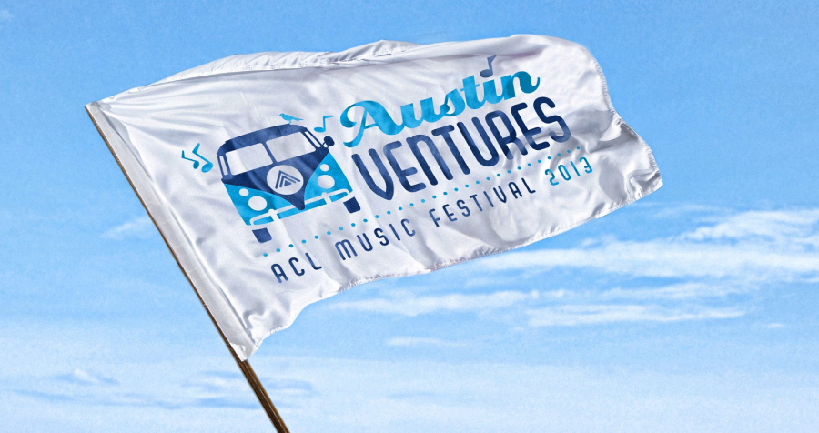
Since 2004, Left Hand Design has created distinctive visual identities from our Austin studio for festivals that need to attract attention, coordinate complex promotion, and remain memorable from one season to the next. We design festival logos for music, food and beverage, arts, film, cultural, community, and destination events—without defaulting to generic ticket, stage, or confetti imagery.

A festival brand is experienced across far more than a single poster. Guests, performers, vendors, sponsors, volunteers, media, and local partners may encounter it through lineup announcements, ticketing pages, wayfinding, stages, vendor maps, wristbands, credentials, merchandise, social campaigns, email, programs, and post-event content. We build a flexible visual system so those pieces feel unmistakably connected.

Our process combines discovery, audience and category research, original concept development, real-world application testing, two to three revision rounds, and organized production files. The direction is shaped around the festival’s programming, audience, location, atmosphere, sponsor structure, production schedule, merchandise plans, and future editions.

For more than 20 years, Left Hand Design has created bold, memorable festival logo designs that help events stand out. We craft visually striking, strategically designed logos that capture your festival’s identity, connect with audiences, and elevate your event’s presence. From local community festivals to large-scale annual celebrations, our team brings the experience and creative insight to turn your vision into a standout logo.

We’re here to help you reach your goals with festival logo design that gets noticed, builds recognition, and leaves a lasting impression. Our team is passionate about delivering exceptional work and a high level of service, because your event branding should do more than blend in. It should lead with purpose.

Reach out today to learn how Left Hand Design can create a festival logo design that sets your event apart.

Festival Branding Designed for Every Guest Touchpoint

A useful festival identity must stay recognizable at the scale of an entrance banner, in a crowded sponsor lineup, on wearable merchandise, and inside a small mobile ticket. We build the system around real promotion and production needs.


icon logo

Festival Identity & Flexible Logo System

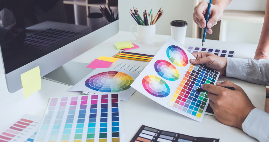
We clarify the festival’s positioning, audience, programming, and personality, then create primary, secondary, compact, and mark-only logos with color, typography, spacing, and usage guidance.

icon web

Ticketing & Campaign Website Design

We extend the identity to WordPress or Squarespace websites with mobile-friendly schedules, lineup or vendor content, ticket paths, sponsor visibility, maps, accessibility information, and clear visitor planning.

icon package

Signage, Merchandise & On-Site Applications

We adapt the system for entrance graphics, stages, wayfinding, wristbands, credentials, vendor maps, sponsor walls, programs, apparel, merchandise, social templates, email campaigns, and post-festival content.

Explore More Left Hand Design Services

left hand design austin tx banner beau morrow

Selected Identity Work from Our Austin Studio

What Clients Say About Working with Left Hand Design

What an Effective Festival Identity Needs to Do

music festival

Build Recognition Before the Gates Open

A festival starts building momentum long before attendees arrive. A recognizable identity connects early announcements, ticket launches, lineup or vendor reveals, community partnerships, social campaigns, email, and local promotion so each impression adds to the same story.

Cheerful Young Women Celebrating Together Outdoors

Create Energy Without Sacrificing Clarity

Color, type, illustration, and motion can create anticipation, but the system still has to communicate dates, locations, schedules, tickets, and visitor information quickly. We balance personality with hierarchy so expressive graphics never overwhelm essential details.

Attract the right customers with clear positioning_

Keep Sponsors, Vendors & Partners Organized

Festivals often bring many organizations into one visual environment. We define hierarchy, spacing, approved lockups, monochrome options, and placement rules so sponsor and partner recognition remains clear without overpowering the festival brand.

The right logo does more than look appealing. Typography, color, and overall style help shape how your festival is perceived. Whether the event should feel bold, artistic, refined, family-friendly, or culture-driven, a custom logo helps express that personality and connect with the right audience.

Friends Using Smartphones Sitting Outside on Sunny Day

Grow Equity Across Annual Editions

A recurring festival should feel familiar without looking frozen in time. A stable core identity can accommodate new dates, locations, themes, performers, vendors, sponsors, and campaign artwork while preserving recognition from year to year.

Festival Logo Design FAQs

A festival logo should make the event easy to recognize while expressing its programming, audience, location, and atmosphere. The visual direction might feel energetic, welcoming, experimental, handcrafted, cultural, premium, or family-friendly, but it should remain distinctive and clear rather than relying on generic stages, tickets, or confetti.

Begin before ticket sales, sponsorship outreach, lineup or vendor announcements, and campaign production whenever possible. A focused identity typically takes four to six weeks for discovery, research, concepts, presentation, two to three revision rounds, and final production. Larger systems or compressed festival schedules should be discussed early so dependencies can be planned realistically.

Yes. We test the strongest direction across entrance graphics, stages, wayfinding, wristbands, credentials, vendor maps, social avatars, mobile tickets, apparel, and merchandise. Responsive lockups, simplified marks, and monochrome versions help the identity remain recognizable when size, distance, material, and production method change.

We can define visual hierarchy, spacing, approved lockups, monochrome options, and placement guidance for sponsor and partner marks. This keeps recognition clear across sponsor walls, stages, programs, websites, maps, credentials, merchandise, and social assets without weakening the festival’s own identity.

Yes. We can create a stable core identity with flexible rules for dates, locations, themes, performers, vendors, sponsors, and campaign artwork. That protects recognition while allowing each edition to feel fresh. Most Left Hand Design identity projects start at $5,000 and scale with the number of applications and the complexity of the system.