









































Tequila Branding for the Texas Palate

Austin Tequila Logo Design and Distillery Branding for Texas Spirits Brands

Competing for Shelf Space from South Congress to West Texas

logo small

For more than 20 years, our Austin studio has watched Texas spirits branding evolve. A tequila brand born here needs more than a polished label; it needs an identity that feels authentic to Hill Country culture while staying sharp enough for crowded shelves at Spec’s, Total Wine, and independent bottle shops.

We build tequila logo systems from the bottle up. Typography, color, illustration, and secondary marks must scale from a 750 ml label to a website, sell sheet, tasting-room sign, or Austin event banner. We test the system for legibility in retail aisles and low-light bar environments while keeping the story specific to the spirit.

Start the conversation about an Austin-designed tequila identity built around your product, audience, and long-term growth.

Our Design Process: From Discovery to Distillate Identity

Our projects move through four clear phases: immersion, creative exploration, collaborative refinement, and final delivery. Each stage keeps strategy and real-world bottle applications in view.

The final asset handoff includes production-ready vector and raster files plus practical guidelines your team and partners can use consistently.

icon logo

Brand & Market Immersion

We begin with a focused questionnaire and stakeholder conversations to understand your story, production approach, audience, and position in the Texas spirits market.

icon web

Conceptualization & StyleScapes

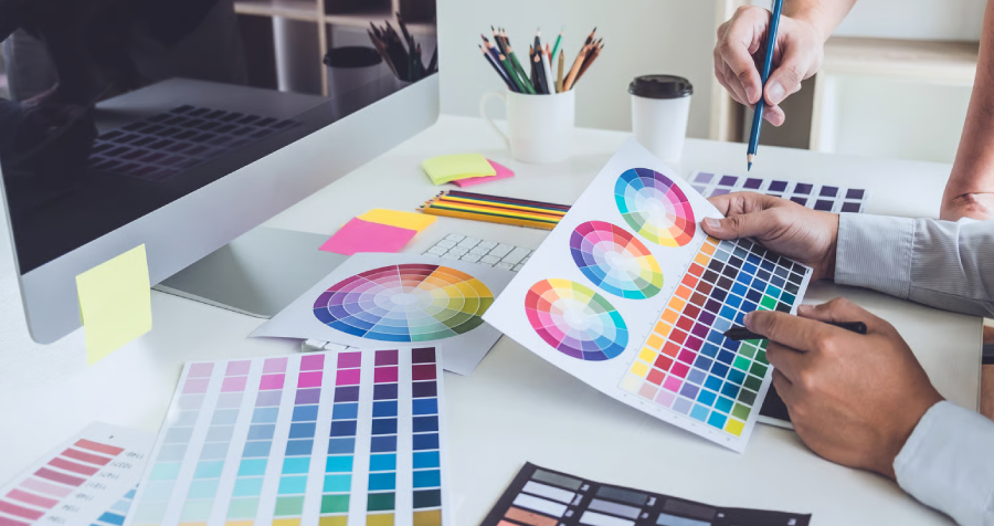
We develop distinct creative directions that show how the identity, typography, color, and imagery could work across a bottle, website, sell sheet, and merchandise.

icon package

Iterative Refinement

We collaborate on the strongest direction, refining the primary mark, secondary lockups, palette, and typographic hierarchy for reliable real-world use.

Asset Handoff & Guidelines

left hand design austin tx banner beau morrow

A Glimpse Into Our Work

The Anatomy of a Tequila Brand That Lasts

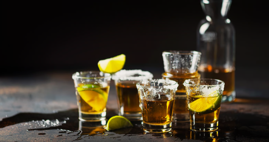
Tequila Shots with Lime on a Dark Surface

Recognition Beyond the Label

A customer may first see your bottle on a shelf, then encounter it on a menu, social post, or coaster. We build primary logos, secondary marks, and typographic standards so the identity remains instantly recognizable across contexts.

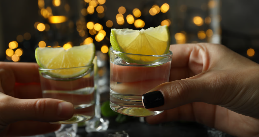
Two Shot Glasses with Limes with Blurred Background

An Impression of Quality & Origin

Before the first sip, the bottle tells a story about origin, process, and point of view. Custom typography, illustration, and material choices help communicate the spirit’s specific character without leaning on generic agave, skull, or hacienda clichés.

Attract the right customers with clear positioning_

Position the Spirit with Intention

Color, type, hierarchy, and label architecture signal whether the product is a premium sipping añejo, an accessible blanco, or a modern experimental spirit. We use those cues deliberately to reach the intended audience.

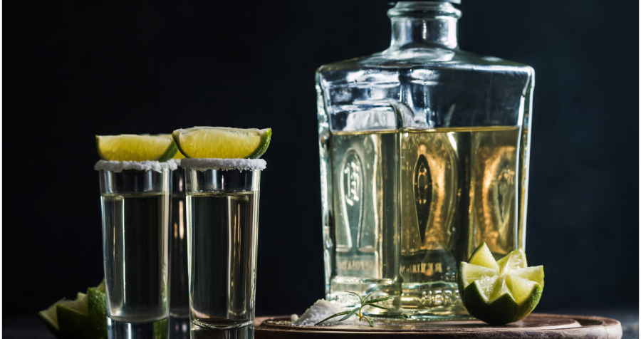
Tequila Bottle with Limes and Salt

Cohesion Across Every Channel

Your brand must stay clear across distributor sell sheets, case boxes, websites, tasting-room merchandise, and events. Flexible assets and guidelines give internal teams and partners a consistent system to work from.

Tequila Branding Questions for Austin Distillers

Authenticity comes from specificity. We focus on the character of the liquid, its origin, process, and point of view, then use custom typography and unique marks that avoid category clichés. The result should feel true to the product rather than borrowed from another brand’s heritage.

We start with brand and market immersion, develop distinct creative directions, and refine the strongest route collaboratively. The final system includes primary and secondary logo assets, production-ready files, and practical brand guidelines.

The right direction depends on positioning. Heritage-inspired typography and restrained materials can suit one spirit, while a cleaner, bolder system may fit another. We build the palette, type, and imagery around the specific product, then test them on labels, retail displays, and digital screens.

A logo is only one piece. The colors, fonts, secondary graphics, label hierarchy, and usage standards are what make the identity memorable and consistent. That system helps the bottle, website, sales materials, and social content feel like one brand.

Standing out begins with a specific story and a distinct visual lane. We study the competitive shelf, identify opportunities in color, typography, iconography, and label structure, then balance recognizable category cues with an ownable point of view.