







































Whiskey Logo Design for the Texas Spirit

Austin-Based Whiskey Logo Design for Texas Distilleries and Spirits Brands

Does Your Branding Reflect Your Terroir?

logo small

Based in Austin’s creative community, Left Hand Design builds brand identities for distilleries and spirits brands. For more than two decades, our family-run studio—led by brothers Beau and Paul Morrow—has created logos rooted in a genuine story and designed to earn attention on the shelf.

We translate your origin, ingredients, process, and point of view into a flexible visual system that feels authentic. From Texas Hill Country producers to distilleries across the state, we create branding that gives a spirit a clear voice before the bottle is opened.

Reach out today to discuss an Austin-based whiskey identity built for your product, audience, and long-term goals.

Our Design Services

Our capabilities are focused on building a complete brand ecosystem for the shelf, the tasting room, and every digital touchpoint.

icon logo

Logo & Branding

We create strategic identity systems, not just standalone marks. The final system includes flexible logo lockups and practical guidelines for consistent use.

icon web

Website Design

We build custom WordPress and Squarespace websites around your story, product line, and conversion goals—from tasting-room visits to distributor and customer inquiries.

icon package

Package Design

We design bottle labels, neck tags, cartons, and supporting packaging for shelf impact, legibility, production practicality, and a cohesive unboxing experience.

Click Lefty to see more services!

left hand design austin tx banner beau morrow

Recent Beverage & Brand Identity Projects

How a Strategic Logo Defines a Whiskey Brand

whiskey

Build Recognition on a Crowded Shelf

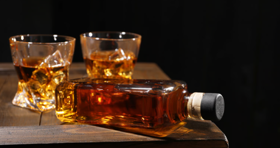
A focused logo gives your brand a visual anchor customers can find in a sea of options. Whether it first appears on a bottle at a South Congress bar, in an Instagram post, or on a retail display, the mark must remain legible, distinctive, and rooted in your story.

Two Men Toasting Drinks Indoors Social Gathering

Make a First Impression That Tastes Right

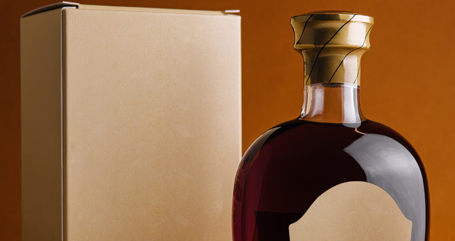
Before a customer tastes the spirit, the bottle communicates a point of view. A considered identity signals the quality and character inside, building interest in your ingredients, aging approach, and the choices that make the whiskey different.

Attract the right customers with clear positioning_

Position Your Brand with Intention

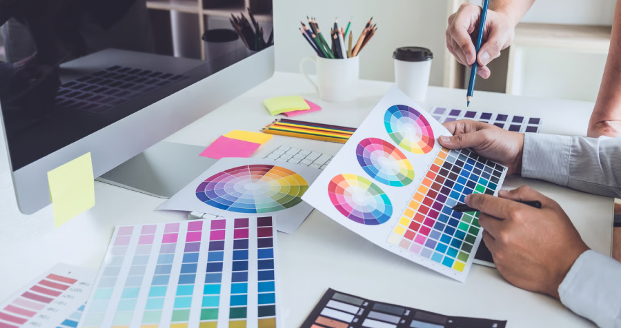
Typography, color, illustration, and material choices signal whether the whiskey is a premium pour, a rugged traditional bourbon, or a modern experimental rye. We use those cues deliberately to connect with the audience you want to reach.

Elegant Bottle of Liquor with Gold Packaging

Ensure Consistency from Barrel to Glass

Your identity must work across bottle labels, cartons, caps, websites, menus, tasting-room materials, and event graphics. Flexible lockups and clear brand standards keep every application recognizable and production-ready.

Whiskey Branding Questions

A great whiskey logo expresses the brand’s origin and character while remaining clear at bottle-label scale. Strong typography, distinctive visual elements, and a flexible mark help the identity feel premium across packaging, retail, and digital touchpoints.

We begin with a deep dive into the brand’s story, audience, product line, and market position. Beau and Paul Morrow lead the strategic and creative work, refining the strongest direction into a complete logo system for packaging, marketing, and digital use.

The right palette depends on the position you want to own. Black, cream, copper, deep brown, and restrained metallic tones can feel established or premium, but we select colors around the brand’s specific story—from Hill Country materials to a more modern East Austin energy.

Packaging is part of the identity from the beginning. We test the logo for bottle labels, neck tags, cartons, and caps so it remains legible, distinctive, and consistent in a dim bar, a bright retail aisle, or an online product image.

Distinctiveness comes from a specific story and disciplined execution, not louder decoration. We avoid generic barrels, crests, and borrowed heritage cues unless they are genuinely relevant, then build an ownable system around typography, imagery, and packaging.