
Start with what makes the business specific
Write down who you serve, what you offer, and what customers should remember after meeting the brand. A brief that only names an industry and a mood leaves the most important decisions open. Define the message, intended applications, exclusions, and person responsible for approval before choosing a direction.
A familiar category symbol can help people understand the kind of business. The risk appears when the same mark would make equal sense with a competitor’s name underneath it. Separate that recognition problem from whether the first preview looks balanced, contemporary, or expensive.
Compare the context around the logo
Build a reference set of direct competitors and the brands customers will see beside yours. Keep that set fixed while reviewing candidates. Record repeated symbols, layouts, lettering styles, and color combinations; then ask what your direction contributes beyond those conventions. Our guide to similar-looking AI logos explains the warning signs in more detail.

Develop an idea you can explain
Choose a concept with a reason tied to the business, then refine the symbol, letterforms, spacing, and proportions. Custom work does not require making every element unfamiliar. It requires deliberate choices that work together and a clear explanation of what they communicate. Reject a change that only adds decoration without improving recognition or usefulness.
A polished logo still needs a reason to belong to your business.
Review the mark without the mockup
Use the approved brief and competitor set as references. Test the plain mark at your actual avatar, document, packaging, or sign sizes, starting with the smallest or most restrictive use. Change one feature at a time and record what improved or failed. Name the reviewer and keep the approved version.
| Check | Warning sign | What to review next |
|---|---|---|
| Symbol | The idea fits almost any competitor. | Explain the specific connection to your business and compare nearby marks. |
| Typography | The name looks default, awkward, or unclear. | Check exact lettering, spacing, voice, and legibility at the intended size. |
| Color | Color or a dramatic scene supplies all the impact. | Review the raw mark in one color before returning to the palette. |
| Applications | The logo only works in one large composition. | Compare approved horizontal, stacked, and small-format versions in real layouts. |
| Release | Repeated fixes keep changing the mark. | Return to controlled artwork, resolve the underlying issue, and repeat the same checks. |
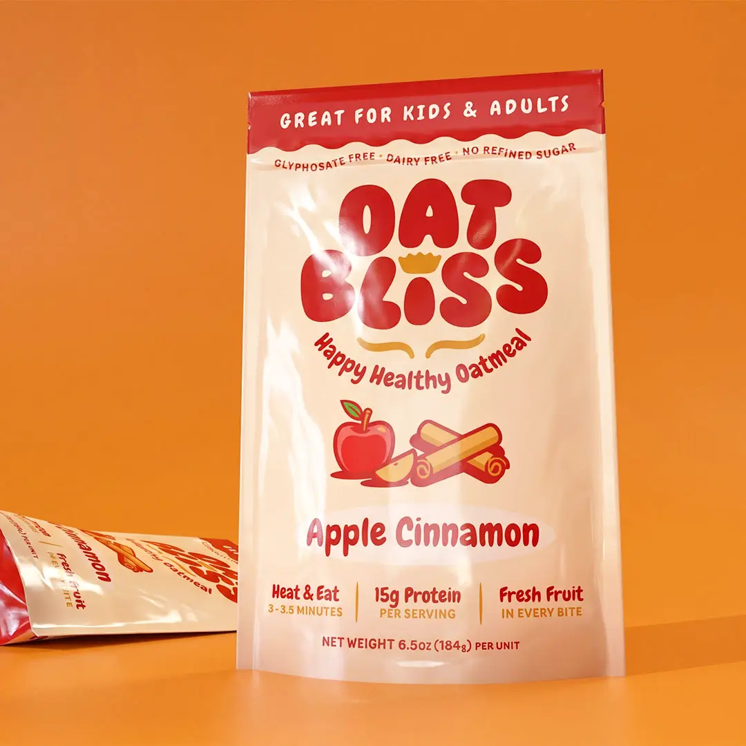
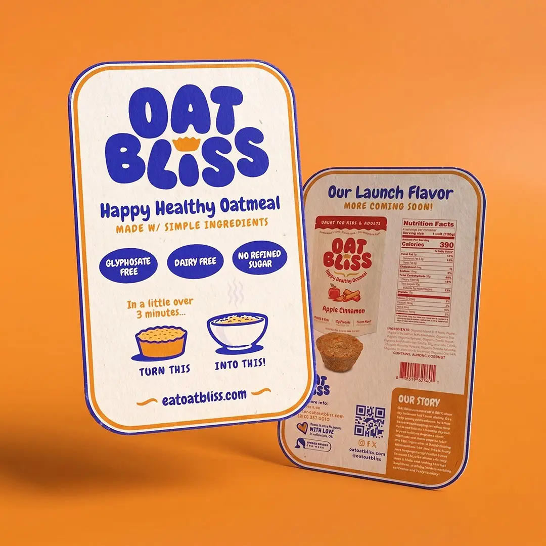
The Oat Bliss project shows a logo, illustrations, and packaging working as one visual system. These published applications illustrate design decisions, not a measured AI experiment. Approve a direction when it fits the brief, stands apart from the reviewed competitors, and survives the required uses; correct a specific defect and retest, or reject a concept that remains interchangeable.
Carry the decision into a complete identity
Keep the defining shapes, typography, and color rules consistent across future materials. Prepare approved masters, practical logo variants, and usage notes so a new vendor does not reinterpret the design. Our brand recognition guide explains how repeated, consistent use supports the identity over time.
Here, “generic-looking” describes visual interchangeability, not a legal finding. The USPTO’s trademark-strength guidance discusses legal distinctiveness separately; a visual review does not establish trademark availability or copyright ownership. Keep process records and seek qualified legal advice for clearance and rights questions. This article provides general design guidance.

When to bring us in
Bring Left Hand Design in when your strongest option still feels interchangeable or the identity needs to work beyond one preview. Our logo design and brand identity services can connect business direction, distinctive artwork, and the practical files your team needs.