Put the brand promise into plain language
Describe who you serve, what they come to you for, and what your business consistently does for them. Replace words such as “authentic,” “premium,” or “caring” with examples of decisions and behavior. If the promise is unclear in conversation, a polished symbol will not explain it on its own.
Here, “brand soul” means that practical combination of purpose, values, audience, voice, and experience. The logo can help express it, but customers also meet it through your product, service, language, and conduct. Decide which part of that story the identity should emphasize before choosing its appearance.
Explore styles with a useful brief
Use generated directions to compare visual possibilities and reveal what feels appropriate or wrong. Give each option the same audience, message, exclusions, and intended uses. Record why you respond to a shape, type treatment, or mood. Our guide to AI and brand style explains how preferences become more useful when tied to specific criteria.

Give visual choices a reason
Ask what the symbol, lettering, proportion, and color communicate together. An approachable business might need warmth without looking careless; a technical service might need clarity without becoming anonymous. Check the idea against actual competitors and the language your customers use. A designer can question the assumptions, refine the artwork, and explain the trade-offs behind the chosen direction.
The meaning comes from decisions your business can stand behind.
Review meaning and use together
Keep the brief and competitor reference set fixed while comparing candidates. Place each mark in the actual digital and physical uses that matter first, including the smallest placement and a one-color version. Change one treatment at a time, name the reviewer, and record what fits the promise, what becomes unclear, and what needs another pass.
| Brand element | What an image may suggest | What your team must establish |
|---|---|---|
| Purpose | A confident, playful, or refined mood. | Which real promise the business can consistently deliver. |
| Story | A symbol associated with an industry or theme. | The specific origin, belief, or point of view worth expressing. |
| Audience | A familiar style that appears suitable. | Whether the intended customers understand the tone and message. |
| Difference | An attractive arrangement of type and shapes. | How the identity compares with relevant competitors and avoids interchangeability. |
| Consistency | A coordinated set of mockups. | The controlled artwork and rules that survive actual use sizes and surfaces. |

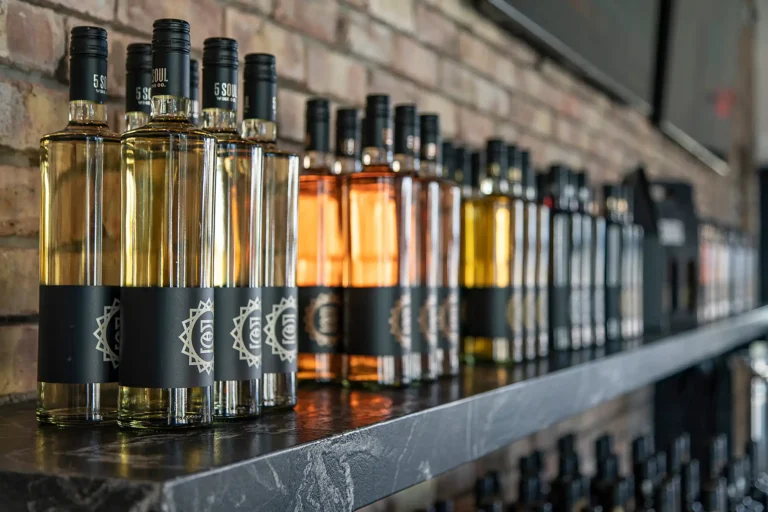
The 5 Soul Wine Co. project connects an approachable wine destination with packaging, apparel, and property branding. The published work illustrates a coherent identity across applications; it is not an AI experiment or a measured test of customer response. Accept a direction when it fits the agreed brief and required uses, correct a specific defect and retest, or reject a concept whose meaning remains interchangeable.
Keep the promise consistent after launch
Document the chosen logo versions, typography, colors, tone, and production files so future materials carry the same intent. Check that daily communication and service support the promise expressed visually. Our brand rollout checklist helps connect that decision to teams, vendors, and customer touchpoints. If repeated fixes keep changing the mark, return to controlled master artwork before approving more applications.


When to bring us in
Bring Left Hand Design in when you can describe the business clearly but the visual direction still feels disconnected. Our logo design and brand identity services can help turn that brief into a specific mark, a coherent system, and files your team can use.